


![New Financial Data: How COVID-19 Impacted the Bottom Line of 500+ Schools [Whitepaper]](https://www.curacubby.com/hubfs/Curacubby_March2022/Images/5fcd54fa4e5b8d22116df5f5_thumnail-bottom-line-covid-whitepaper.png)
Setting the Scene
We all know the COVID-19 pandemic tore through the already fragile fabric of education this year. Families and educators were impacted alike as a result.
The ramifications were plenty. And we heard a lot about very important issues ranging from digital inequity to teacher burnout.
One understudied area, however, was the financial impact on schools and whether institutions possessed the financial ability to maintain operations.
Earlier in the pandemic, this was tenuous:
- As of July, the majority of child care programs were four months from financial insolvency.
- In this same period, child cares were operating at less than a third capacity.
- K-12 schools across the country shifted to online learning, many seeing a drop in enrollment and facing a budgetary crisis for both public and private schools alike.
Now, as new data has reframed the rate of transmission in schools and state governments have allowed for the return of in-person learning in a majority of cases, these challenges are being mitigated.
The majority of child care programs are now operating closer to their pre-pandemic capacities, a significant improvement from the spring and summer. And even in states without in-person learning for K-12, child cares have been able to continue operations.
At the same time, over three-fourths of K-12 independent schools have seen their enrollment increase or stay the same as parents look for public school alternatives where online learning is more common.
The data presented in this report is a result of these two dichotomies – a financial shockwave that has rocked the balance sheets of schools.
School Financial Data from January to October 2020
This report will give real numbers to the financial shockwave. Using data from Curacubby’s payment processing and accounting platform for schools, we analyzed the financial activity by our customer schools and segregated the data by school type: early childhood, K-12, and after-school programming.
To anonymize the data, including payment totals, we took all numbers as a percentage compared to January 2020. Therefore, if a payment amount exceeds January, the percentage will be greater than 100; and if it is less, then it is reflected as less than 100 percent.
In other cases, when payment volume wasn’t tabulated in the results, we used the raw numbers from the data set.
Here are the data points we’ll cover:
- Total payments processed
- Total invoice amount
- Number of invoices
- Average invoice amount
- Maximum invoice amount
- Standard deviation in the invoice amount
Let’s get down to it.
Total Payments Processed by Schools
We’ll start with the total payments processed by our customer schools. This data set looks at every financial transaction that schools facilitated through Curacubby, from tuition payments to after-school care or donations.
CHART 1. TOTAL PAYMENTS PROCESSED BY PAYMENT TYPE
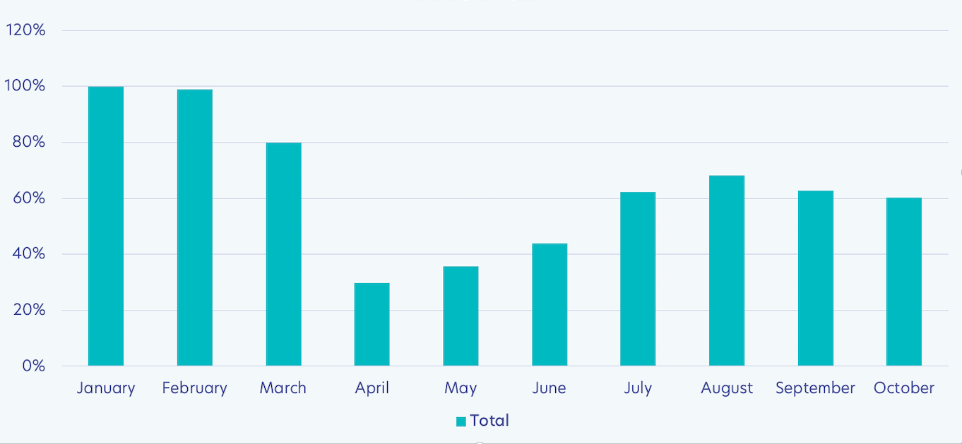
Total Payment Volume
As is expected, there’s a significant drop in payments after March. However, payments began to trend upward after July.
Specifically, in April and May, total payments being processed by schools amounted to 30 percent of January’s amount.
Now, we are closer to 60 percent, meaning payments doubled from April to October. That’s a major increase, even if they still lag from their pre-COVID volume.
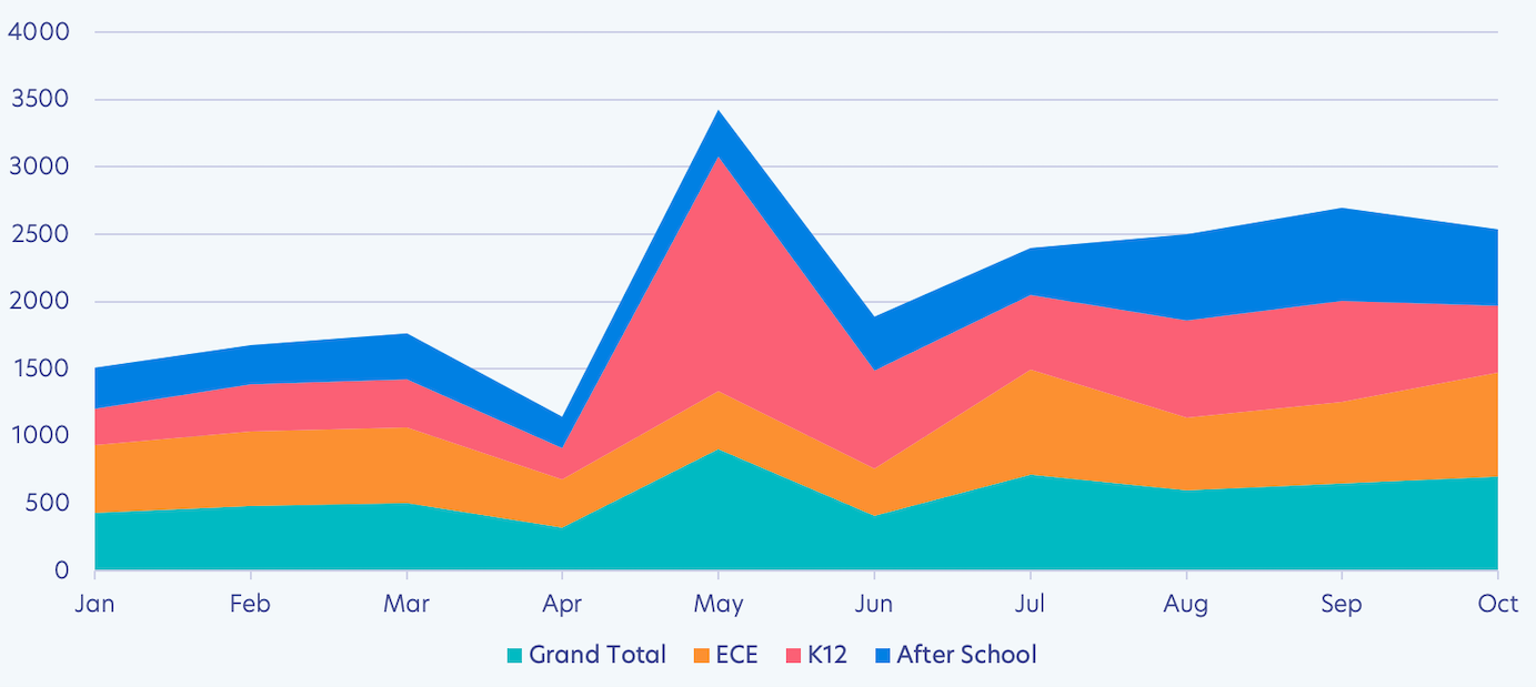
Sum of Invoice Amount by Schools
Next up is the sum of invoice amounts, which assesses the amount schools are billing, not necessarily what they received.
CHART 2. SUM OF INVOICE AMOUNT BY SCHOOL TYPE
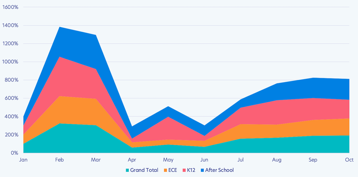
Like the total payments processed, we saw a peak in February, followed by a drop after March and an increase post-July.
Initial drops in enrollment, decreased tuition, or paused operations could account for this drop.
Across all categories, however, there is a revival in invoicing after June, which means there was a resumption or increase in billable activities or billable customers.
The increase after June is especially significant because this occurred during summer months, when we’d expect a drop. Yet, we instead saw a major leap forward for the financial recovery of schools.
In addition, even extra-curricular programs, which were often the first programs to be cut, are seeing a revival, as evidenced by the blue from August through October.
Moreover, as the total payments processed has increased, so has the sum amount of all invoices issued by schools. And across all categories, the invoice sum is higher than January levels, which was not true for the total payments covered in the section prior.
The Takeaway: Schools are invoicing families a similar amount as they were pre-pandemic.
Total Count of Invoices by Schools
This chart illustrates the raw number of invoices being issued by schools. The count of invoices issued plummeted in April, May, and June, but the number has increased since.
CHART 3. INVOICE COUNT BY SCHOOL TYPE
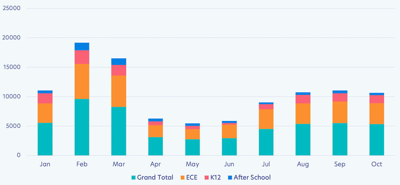
What we can deduce is that there are more activities and/or customers facilitating cash flow. Growing enrollment, fundraising activities, and additional programming likely all have an impact on this.
In fact, the count of invoices in August, September, and October all rival the number of invoices issued in January.
It’s likely that as these invoices become due, the payments will feed a similar increase in the total payments processed by schools.
The Takeaway: Schools are issuing invoices at the standard level they were pre-pandemic.
Average & Maximum Invoice Amount for Schools
Beyond the number of invoices or their sum, it’s also important that we consider the average invoice amount.
CHART 4. AVERAGE INVOICE AMOUNT BY SCHOOL TYPE
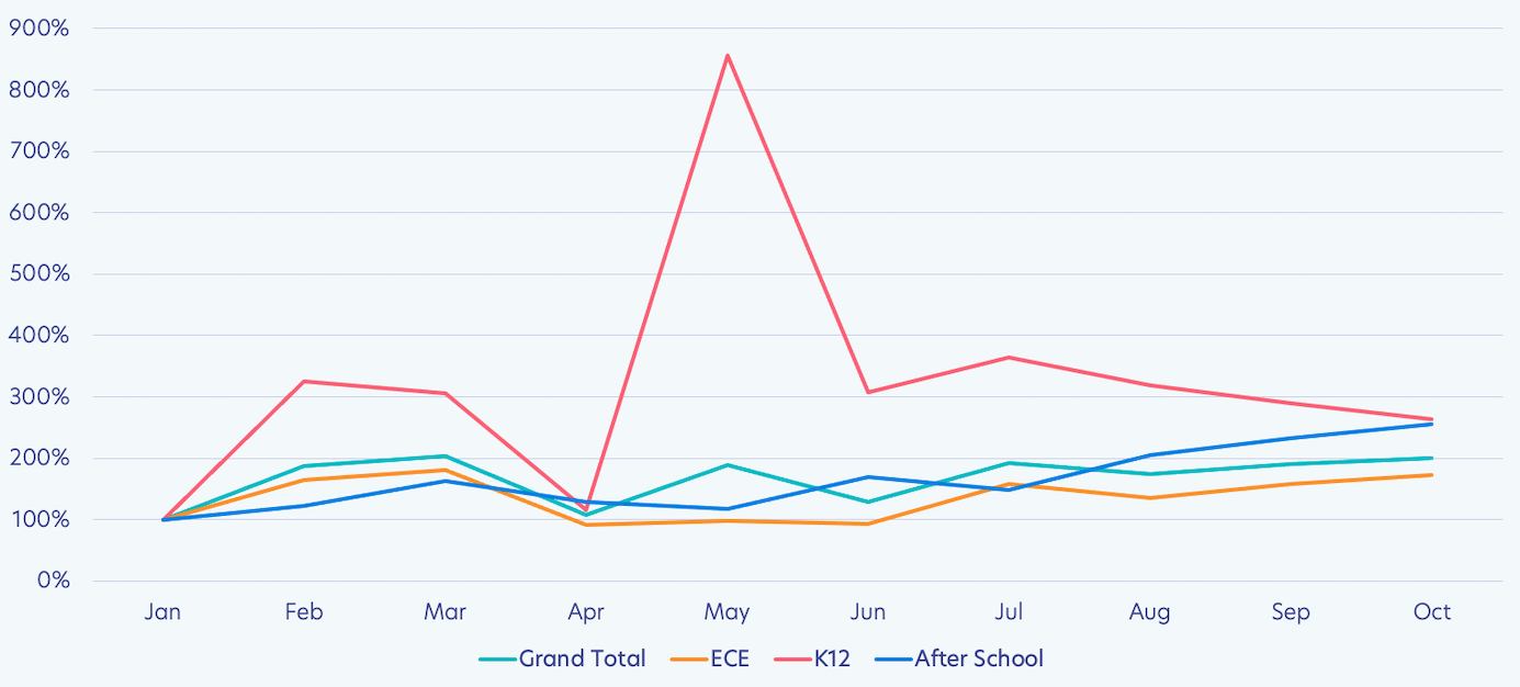
The most obvious part of this chart is the massive peak in May for K12. This seemed odd, so we looked into it, and it was a sizable donation or grant made to a school. If we take it out, the line fits into the overall trend.
Generally speaking, the narrative projected in this chart is again divided into three categories: normal pre-pandemic, abnormal early pandemic, and new normal late pandemic.
The result is a U-shaped curve, where we see fall begin to match what we saw in winter, while spring and summer exhibit a drop.
Looking at the average invoice amount, we can see that schools are now issuing invoices with a greater price tag. This could be from a number of things like a return to full-day classes, increased tuition rates, or new programs.
But this data gets really interesting when we break it down further.
CHART 5. MAXIMUM V. AVERAGE INVOICE AMOUNT BY SCHOOL TYPE
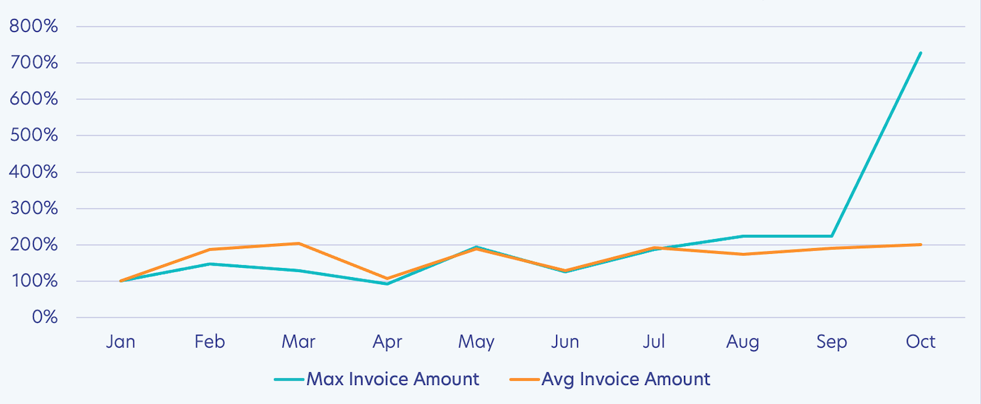
Maximum Invoice Amount: Interestingly, the maximum invoice amount never went down all that much from January. And it has grown more recently. This is likely because schools were still charging for their tuition-based programs, even if the number of students they invoiced dropped.
Now with the increase, there may be additional billable items being added to invoices as programs diversify and resume operations.
The Takeaway: The maximum invoice amount stayed relatively steady but is now growing as schools revitalize their operations.
Average Invoice Amount: The average invoiced amount seems to have experienced greater variability. This is ultimately what we care about most because it’s the mean of the maximum and minimum fluctuations.
And the good news is that it is increasing and now ranks above what it did in January. This is an important sign of recovery – and dare we say financial growth.
The Takeaway: An overall increase in the average invoice points to growth, something beyond just recovery.
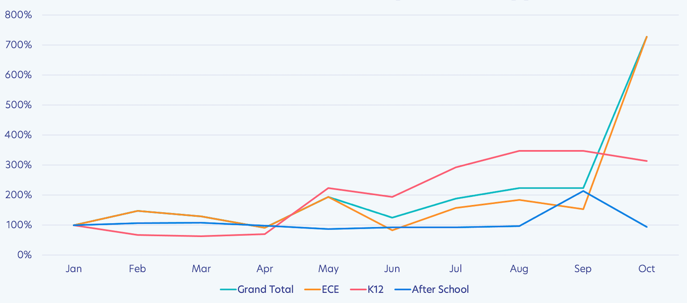
Next, you’ll find the breakdown of the maximum invoice amount by school type for reference.
CHART 6. MAXIMUM INVOICE AMOUNT BY SCHOOL TYPE
Standard Deviation in Invoice Amount for Schools
Standard deviation calculates the level of variability relative to the mean. Essentially, the standard deviation tells us how much variability there is in the data.
CHART 7. STANDARD DEVIATION IN AMOUNT BY SCHOOL TYPE
There was a massive peak that persisted from April through June, meaning there was a significant range in invoice size.
However, in late summer and into the fall, the deviation has stabilized.
It’s not at pre-pandemic levels, but it’s still reassuring. With less deviation, leaders can better operationalize their business management, predict growth, and run their schools.
The Takeaway: There is still variability in the dataset, but it has evened out significantly.
Conclusion
What do these numbers tell us? In the early months of COVID, the financial situation of schools was tenuous at best and catastrophic at worst. But something has changed…
- Schools are receiving more payments from their customers than they did earlier in the pandemic but not as much as they did pre-pandemic.
- Schools are invoicing families a similar amount as they were pre-pandemic.
- Schools are issuing invoices at the standard rate they were pre-pandemic.
- An overall increase in the average invoice amount points to growth, something beyond just recovery.
- The maximum invoice amount stayed relatively steady but is now growing as schools revitalize their operations.
- There is still variability in the dataset, but it has evened out significantly.
The story weaved into this data reminds me of a quote from one of our customers, Jennifer Farrand, who is the Assistant Principal at Academy St. Benedict:
"Change is definitely the constant. We have found ways to make it work. And we do see a lot of bright things. There are moments of hope and joy, and we have faith that 2021-2022 will look different. That’s what keeps us going."
Is this a story of recovery? Yes. Is it a story of growth? Cautiously, it’s too early to tell. Optimistically, we can follow the trends to that assumption.
Time will tell us more.
Concretely, this is, however, a story of leaders who rallied together to ensure students still learned, communities remained connected, and school doors will remain open.
Education is the most important resource in our economy. And the numbers – these numbers – tell us there is reason to hope schools will get through this.